
There is something quietly captivating about autumn and winter weddings.
As the light softens and the evenings draw in, the season lends itself to a different kind of romance, one shaped by rich colour, tactile details and the warmth of an intimate setting.
Think deep botanical greens, smoky blues, earthy rusts and muted neutrals, layered with seasonal flowers, natural textures and softly lit spaces. These darker wedding colour palettes offer a sense of intimacy and depth, creating an atmosphere that feels both expressive and effortlessly romantic.
The beauty of a moody palette lies in its contrasts: the interplay between deep, saturated tones and softer, more delicate details. A velvet like petal against a muted linen, trailing foliage against a dark vessel, or a scattering of flowers across a beautifully layered table.
From the quiet romance of dusty blue and deep green to the warmth of autumnal rust and the drama of near black tones, these five colour palettes explore different ways to bring a little atmosphere to an autumn or winter wedding.
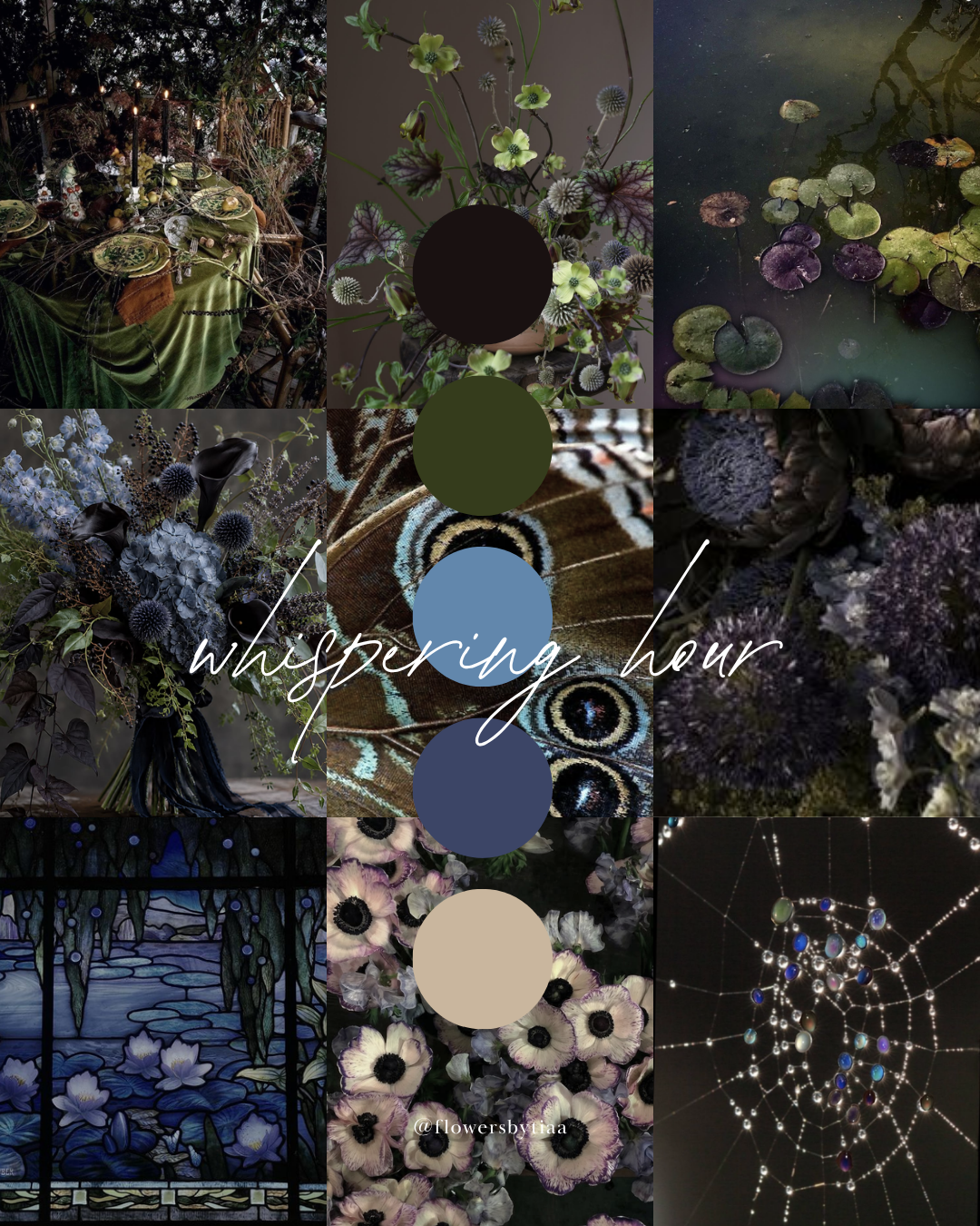
Whispering Hour
Deep Green · Dusty Blue · Warm Ivory
A study in soft, dusky tones, Whispering Hour draws on the quiet beauty of the moments between daylight and dusk.
Deep botanical green and muted blue sit alongside warm ivory, creating a palette that feels understated yet quietly expressive. There is a coolness to the blue, softened by the warmth of ivory and grounded by the richness of green.
Imagine this palette brought to life through dusty blue hydrangeas, pale blue delphiniums, white anemones with dark centres and blue/grey scabiosa, surrounded by delicate, dark green foliage. The contrast between the fuller blooms and finer, more delicate stems creates a sense of ease and gentle irregularity, allowing the flowers to move naturally within the arrangement.
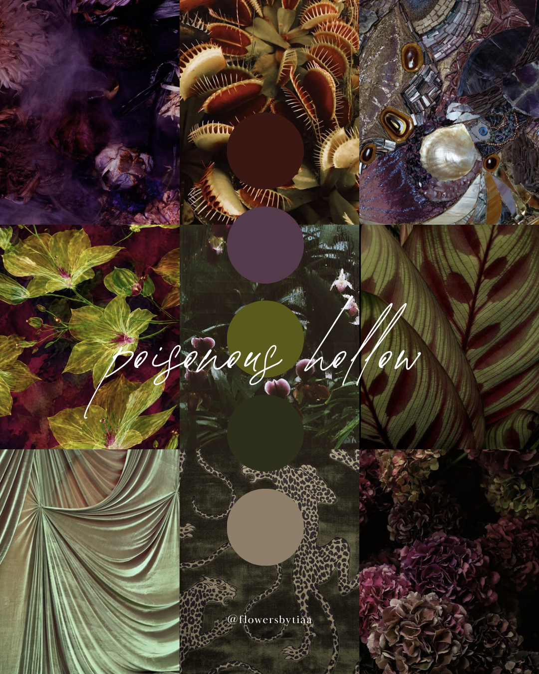
Poisonous Hollow
Deep Plum · Olive Green · Muted Mauve
A little mysterious and richly layered, Poisonous Hollow takes its cues from the deeper shades of an overgrown garden.
Deep plum and muted mauve bring a velvety softness to the palette, while olive green introduces an earthy, botanical quality. Together, the colours feel romantic and slightly untamed, with a hint of woodland enchantment.
The flowers might include deep plum hydrangeas, dark purple orchids, green anthuriums and plum toned calla lilies, woven through with sculptural, dark green foliage. The unusual forms and contrasting textures bring depth to the arrangement, creating a sense of mystery and a slightly surreal, botanical quality.
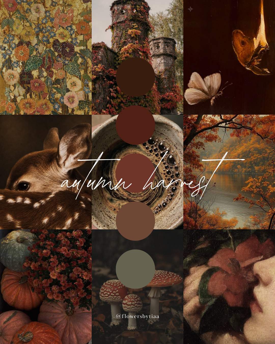
Autumn Harvest
Rust · Burnt Orange · Warm Brown
Inspired by the changing landscape of autumn, Autumn Harvest brings together the warmth of fading leaves, sun baked earth and the last golden light of the season.
Rust, burnt orange and warm brown create a palette that feels grounded and richly seasonal. The colours sit beautifully alongside natural materials, from weathered wood and textured ceramics to softly rumpled linens.
For the flowers, think rust coloured chrysanthemums, burnt orange dahlias, warm toned cosmos and golden orange celosia. Dried grasses, seed pods and autumnal foliage add another layer of texture, bringing a sense of movement and the feeling of a garden settling into autumn.
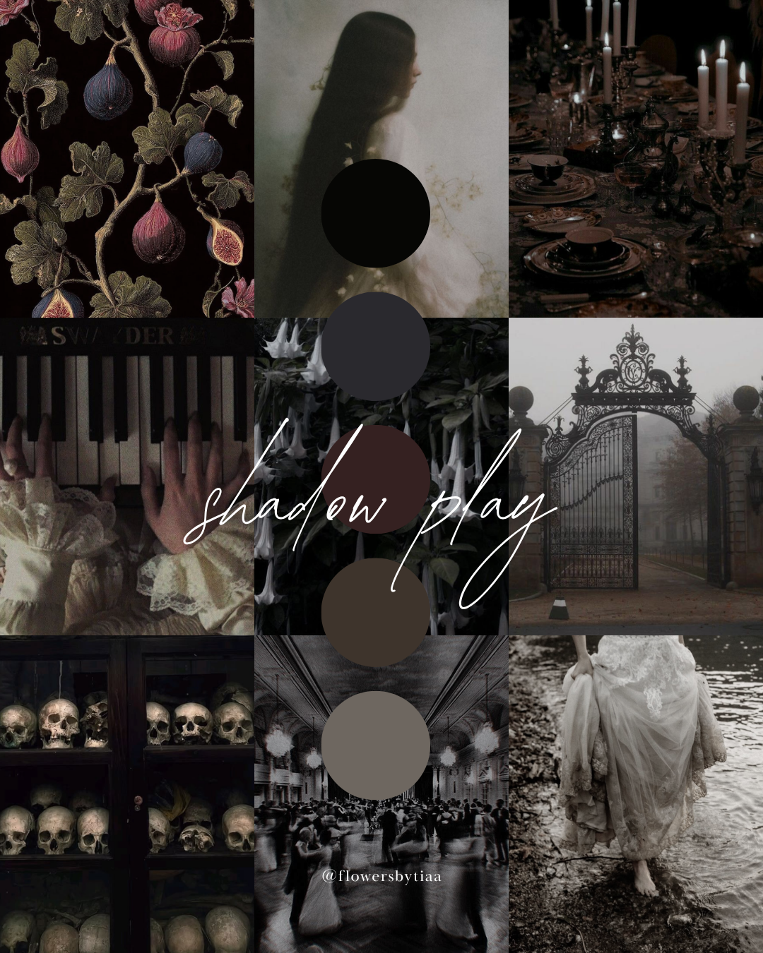
Shadow Play
Black · Espresso Brown · Charcoal
Dark, understated and quietly dramatic, Shadow Play explores the depth of near black tones and the subtle warmth of espresso brown.
Black, charcoal and rich brown create a palette that feels atmospheric without relying on brighter accent colours. The interest lies in the nuances between the shades, the interplay of light and shadow, and the textures that emerge as the light shifts throughout the space.
For the flowers, think near black calla lilies, deep burgundy black anthuriums and dark chocolate cosmos, complemented by pale grey or white orchids and dark, sculptural foliage. The contrast between the deeper blooms and lighter details introduces a little definition, while the varied forms bring a loose, sculptural quality to the arrangements.
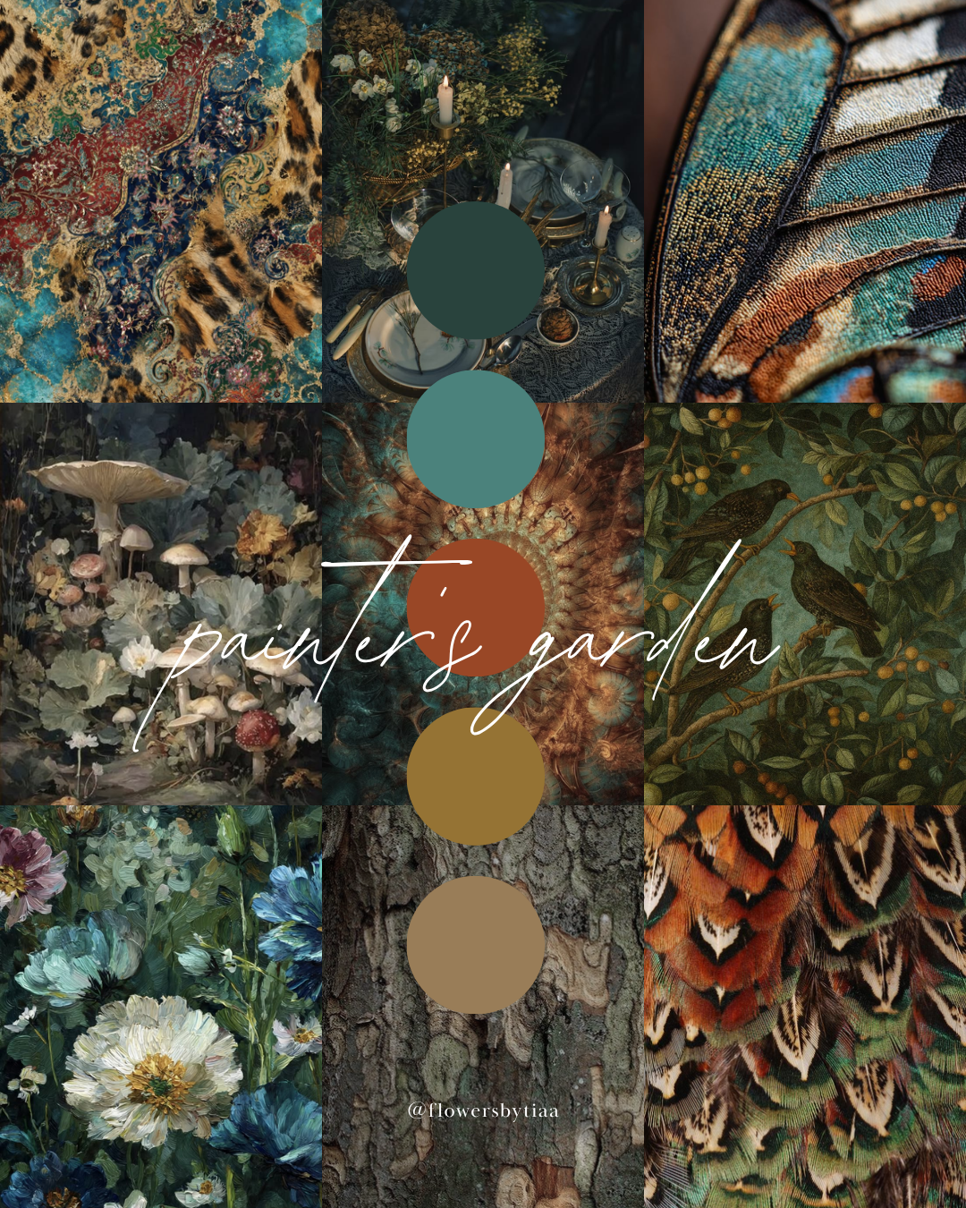
Painter’s Garden
Deep Teal · Ochre · Earthy Green
Painter’s Garden is a study in colour and contrast, bringing together deep teal, muted ochre and earthy green.
There is a painterly quality to this combination: the cool richness of teal set against the warmth of ochre, with earthy green drawing the colours back to the natural world. The result feels expressive and botanical, with a little more brightness than the other palettes in this collection.
For the flowers, think deep blue delphiniums, ochre toned chrysanthemums, golden craspedia and rust coloured cosmos, layered with blue green foliage and textured greenery. The contrast between the cooler blue tones and warmer ochre and rust gives the arrangements a sense of depth, movement and natural character.
Finding a Palette That Feels Like You
A wedding colour palette doesn't have to follow a particular trend or fit neatly into one aesthetic. It can be dramatic or understated, richly layered or softly muted, or somewhere in between.
These five palettes are simply a starting point; an invitation to explore colour, texture and atmosphere, and to discover the combinations that feel right for your celebration.
At Flowers By Tia, I'm drawn to flowers in their most natural state: growing freely, reaching in different directions and never quite following a perfect plan. I love creating floral designs that capture that same feeling, with seasonal flowers and foliage arranged to bring movement, texture and a sense of place to a setting.
For me, the most memorable wedding flowers are those that feel as though they belong exactly where they are, complementing the surroundings while adding something of their own.
If you're planning an autumn or winter wedding and have a particular palette or atmosphere in mind, I'd love to hear about your ideas.
Planning your wedding flowers?
Flowers By Tia creates bespoke floral designs for intimate weddings and celebrations in London and beyond.